PREV ARTICLE
NEXT ARTICLE
FULL ISSUE
PREV FULL ISSUE
ARTIST GARY TAXALI DESIGNS COINS FOR ROYAL CANADIAN MINT
Here's an article about an artist collaborating with the Royal Canadian Mint.
-Editor
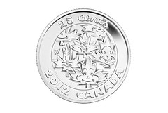
Taxali is known for his reinvention of pop art and iconography reminiscent of the 1930s with comparisons to pop culture masters like Keith Haring and Andy Warhol. Fine art, pop culture and 1930s style iconography and graphics are intertwined in the unique retro style of the coins. The Taxali designed coins are a unique and marked departure from the Mint's usual coin designs with a more edgy, vintage yet contemporary style. Each coin is like a miniature collectible piece of Taxali art with the artist's initials engraved on the coin that will excite Taxali fans worldwide. The coins feature Taxali's recognizable pop culture imagery infused with his retro graphic vintage style. The words "25 Cents", "2012" and "Canada" are depicted on the coins in Gary's famous font called "Chumply", the first time the Mint has allowed an artist to change the typography on coins. "The Mint is pleased to work with Gary Taxali on this year's gift sets," says Patrick Hadsipantelis, Vice President of Marketing and Communications at the Royal Canadian Mint. "His renowned artistry brings a new and unique twist to these special keepsakes which celebrate some of life's great moments".
What if Andy Warhol had designed coins? Or Picasso? What would they look like? I often pass a body shop on the Pennsylvania Turnpike. It's called "Picasso Auto Body", and I've always visualized their work as a car with a radio where the exhaust pipe should be, headlights on the side, and a seat on the roof, like Granny's rocker on The Beverly Hillbillies... But I like the idea of freshening up the lettering style on coins. Bureaucrats tend to put style guides in place (with all the best intentions), but even the best styles feel stale after the passage of time. Let's mix it up a little!
-Editor
To read the complete article, see:
Artist Gary Taxali collaborates with the Royal Mint
(www.artdaily.org/index.asp?int_sec=2&int_new=53064)
The Numismatic Bibliomania Society is a non-profit organization promoting numismatic literature. See our web site at coinbooks.org. To submit items for publication in The E-Sylum, write to the Editor at this address: whomren@gmail.com To subscribe go to: https://my.binhost.com/lists/listinfo/esylum All Rights Reserved. NBS Home Page Contact the NBS webmaster 
|