PREV ARTICLE
NEXT ARTICLE
FULL ISSUE
ARTISTIC STYLE REVEALS MAKER OF SANSOM MEDAL RESTRIKE
When looking at a coin or medal, what should you look for? Tony Lopez submitted this article encouraging medal collectors to consider the artistic style as well as the standard numismatic touchpoints of die characteristics such as letter placement. Thanks!
-Editor
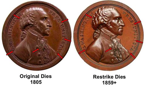
I recently finished working on an article on the 1776 Franklin American Beaver medal that was published in the December 2013 MCA Advisory. In the process of examining all of the medals made by Joseph Sansom, I made an important discovery that I wanted to reveal which was too far outside the focus of my article to include there. According to Rulau /Fuld in Medallic Portraits of Washington, The Joseph Sansom 1797 Washington Presidency Relinquished medal was first struck approximately 1807 (though possibly as early as 1805) with dies engraved by John Reich. They state that due to the popularity of Washington medals, the medals were re-struck beginning in 1859 at the US Mint using the original obverse dies, and replacement reverse dies. (The popularity of Washington medals at the time is evidenced by the 1860 Washington Cabinet medal (Julian MT-23) showing the display of Washington medals at the US mint – with a wonderful depiction of tiny little Washington medals below a bust statue of Washington.) On closer examination, the obverse on the restrikes is not struck from the original die. Or an exact copy hubbed from the original die. I am attaching two graphics. The first one shows the two obverses side by side original on the left, restrike on the right. The arrows point to only some of the differences.

1) The first initial “G.” nearly touches the shoulder of Washington on the original; on the restrike there is a larger gap. 2) The periods after “PRES.” And “UNIT.” are slightly above the base of the lettering on the original; it is lined up with the base of the lettering on the restrike. 3) There is a larger gap between the “STA.”. and Washington’s bust on the originals vs. the restrike. 4) The small top button of Washington’s vest touches or is slightly under Washington’s coat on the original; there is a gap between the same button and Washington’s coat on the restrike. 5) There is a noteworthy indentation in Washington’s hair (peruke) below the “O” of “WASHINGTON” on the original; the indentation is not as deep or sharp on the restrikes – and is positioned between the “O” and the “N”.

The second graphic is a transparent overlay of the original over the restrike. The profile of Washington’s face has been lined up on both. You can see how the lettering is lined up completely different relative to the bust on the original and restrike. Less obvious it is the fact that the two busts do not line up at the shoulder or chest, and the back of the hair line and ribbon does not line up. The two busts are not accomplished using identical proportions and angles. Clearly the restrikes are not struck with original dies, nor are they an exact copy of the original die.

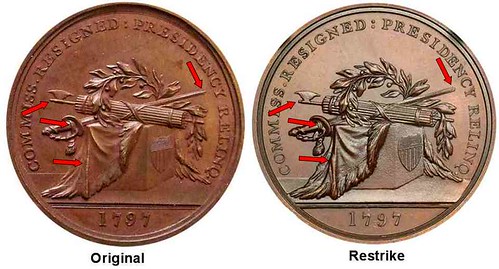
As to the Reverse, Rulau/Fuld have already identified that the “Q “after “RELIQ.” is closer to line of the ground below the pedestal on originals. Earlier, in Julian’s Medals of the United States Mint, Julian stated that “Although Witham points out a sure way of determining an original from a restrike (recutting of the figure 9 in the date 1797) it has been traditional, though less exact, to determine the difference by the distance of the Q in RELIQ from the pedestal; on the original it is closer.” I don’t necessarily agree with Julian on this point; in fact it is much easier to see the distance of the Q from the line of the ground (not the pedestal as stated) with the naked eye than trying to figure out if the 9 is recut, which requires magnification. On the originals, the Q nearly touches the line; on restrikes there is an easily discernable gap (a little difficult to see on the graphic as the reverse of the image came out a little blurry). If you take a closer look, you will discover that none of the descriptions of the differences are truly correct. Technically, the Q is not actually closer to the line on the originals – look carefully, the LINE of the ground is LOWER on the restrikes, creating the larger gap. It creates the same difference comparatively, but artistically, the difference is important in that the artist accomplished the design by using a different artistic style with the ground placed lower, not with the Q placed further away. But it is much easier to tell the difference than simply the “Q” or the re-cutting of the “9“. Which gives me the opportunity to jump on a soapbox. Too often we look at lettering to find differences, something we learned to do from coin collecting. Look at the artistic style! The replacement reverse die is not only different in the placement of the letter Q and the re-cutting of the date. Take a closer look. It has the same design elements in the same basic location, but it is a copy die, executed by a different artist copying the original. Look back and forth between the original and restrike, and note the fine details of how two different artists accomplish the same design. The arrows in the graphic only show a few of the differences. The date is wider, every single letter is differently placed, the style of the periods differs, the folds of the drapery are different, the fasces axe is different, the length of the staff of the axe beyond the blade is different , the point of the sword is different (and points to a different spot in the lettering), the ferrule of the swords are different, the fringe has different detail, the gaps between the leaves and berries are different, etc. etc. etc. etc. etc. In proportion and angle and style - EVERYTHING is different. While a pantograph could have been used to create the replacement dies from the original dies or original medals; these are inexact copies. Using a pantograph improperly the details could be muddied, and details can be re-engraved. With no records of the exact process used to make the new dies, we can only look at the medals to figure out what happened. The restrikes are just too far removed from being perfect copies of the originals for them to have been created from a pantograph of the original dies. Now we know that the original dies were only used to strike the original Sansom Washington Presidency Relinquished medals, and the restrikes are only copies with no lineage to those original dies. I hope that this discovery and examination will cause all of us to take a closer look at everything about the differences between medals (and any numismatic items) struck then re-struck later with the same design elements. No artist can make an exact copy, not even of his own work. Only an entirely mechanical process or use of the same original dies can create a precise copy. With restrikes of so many historic medals, for too long we have oversimplified the differences between medals. I have seen many examples of this on Betts medals, and US Mint medals where a little effort, research, and computer technology could unveil their secrets. Also for too long, we have ignored historical medals as also being pieces of art, and failed to look carefully at them artistically. One great example I can give is the previously enigmatic Maryland medals (Betts 34-36). John Adams suspected they were the work of Thomas Simon from their style. I looked through all of the British medals made at the time by Simon and everyone else, and Simon has a very distinctive style matching the Maryland medals. This made me absolutely certain Simon designed the medals. And closer examination revealed that the medals actually have Simon’s mark on them!
Consider the artistic style of everything, especially the designs, and look beyond the lettering. In the computer and internet age of enlightenment we have the resources we need to set aside previous dogma and take a closer more detailed look.
The Numismatic Bibliomania Society is a non-profit organization promoting numismatic literature. See our web site at coinbooks.org. To submit items for publication in The E-Sylum, write to the Editor at this address: whomren@gmail.com To subscribe go to: https://my.binhost.com/lists/listinfo/esylum All Rights Reserved. NBS Home Page Contact the NBS webmaster 
|