
PREV ARTICLE
NEXT ARTICLE
FULL ISSUE
PREV FULL ISSUE
MARCH OF DIMES COIN DESIGNS
Here are my thoughts on the March of Dimes designs from the U.S. Mint.
-Editor
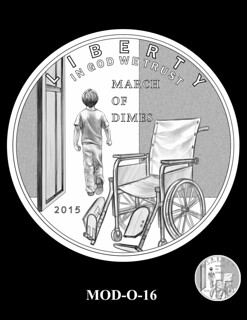
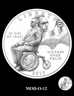
The one on the left is my favorite. The empty wheelchair with a child walking away aptly illustrates the outcome, a near total victory over polio. I remember thinking, "Hey, wouldn't it be really cool to use the Roosevelt Dime as one of the wheelchair wheels!" The design on the right shows why that's not such a good idea. It looks like FDR is sitting on his own head.
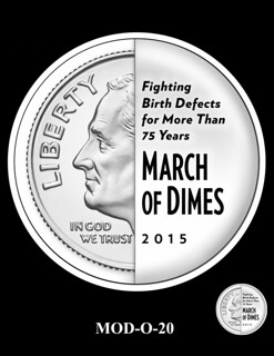
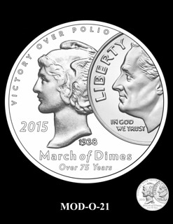
I give the one on the left style points even though I don't like it. The design evokes the slot people placed their dimes in to donate to the cause. The one on the right works better, I think, and has the bonus of being a double numismatic design,
THE BOOK BAZARREWayne Homren, Editor The Numismatic Bibliomania Society is a non-profit organization promoting numismatic literature. See our web site at coinbooks.org. To submit items for publication in The E-Sylum, write to the Editor at this address: whomren@gmail.com To subscribe go to: https://my.binhost.com/lists/listinfo/esylum All Rights Reserved. NBS Home Page Contact the NBS webmaster 
|