PREV ARTICLE
NEXT ARTICLE
FULL ISSUE
PREV FULL ISSUE
DESIGNER PURRINGTON REIMAGINES U.S. PAPER MONEYHere's an article from Fast Company about a young designer who has
created a set of alternate design concepts for U.S. banknotes. -Editor
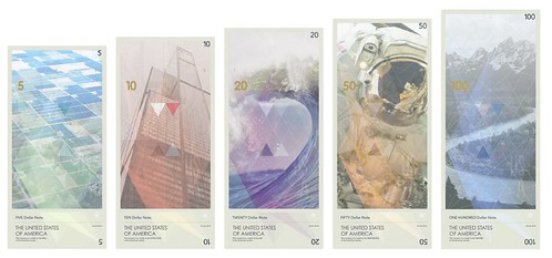 As part of his thesis as a student at the Basel School of Design in Switzerland, Travis Purrington wondered what the dollar would look like with a more modern look. His concept jettisons America's nationalist design language to take a more humanist look at American culture. And it's about time. The design of the United States dollar has not significantly changed since 1929, when the older, larger notes used at the time--colloquially referred to as "horse blankets")--were shrank down to the smaller greenbacks we all know today. Since then, there have been numerous minor revisions to the design of the dollar, mostly as anti-counterfeiting measures; 1957 saw the addition of "In God We Trust" to every bill. But the general aesthetic has always been the same. "After the American Revolution, Congress originally struck down the suggestion that George Washington or any other living man be put on the dollar," Purrington tells me. "They thought it was monarchical; in fact, that's why Lady Liberty was invented. I guess you could say I was trying to think about what our bank notes would look like had Congress stuck to its decision." It's not just the presidents that have been kicked to the curb in Purrington's reimagined dollar. Also gone are all of the eagles, national monuments, ivy creepers, and bizarre masonic symbolism. In their place are patterned corn fields, astronaut helmets, crashing surf waves, and our national forests. The green ink we normally associate with our currency has been swapped out for a more colorful, but still restrained, palette. Purrington was inspired by the Swiss franc, which is completely redesigned every 20 years or so to make sure that the currency's design language is up to date. But Purrington did not choose to model his redesigned dollar after the current Swiss franc. Rather, he chose a "lost" design for the franc as his model: the currency designed for Switzerland in 1991 by avant-garde poster artist Werner Jeker. Jeker's design actually won a contest to replace the current Swiss franc, but it was considered so forward thinking that the President of the Swiss National Bank himself vetoed using it. Compared to the Warholian vibe put forward by the lost Swiss franc, Purrington's reimagined dollar bill feels much classier and refined. But just like Jeker's design, Purrington thinks it would be impossible for his reimagined U.S. currency to ever go into circulation. To read the complete article, see:
Wayne Homren, Editor The Numismatic Bibliomania Society is a non-profit organization promoting numismatic literature. See our web site at coinbooks.org. To submit items for publication in The E-Sylum, write to the Editor at this address: whomren@gmail.com To subscribe go to: https://my.binhost.com/lists/listinfo/esylum All Rights Reserved. NBS Home Page Contact the NBS webmaster 
|