PREV ARTICLE
NEXT ARTICLE
FULL ISSUE
PREV FULL ISSUE
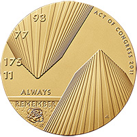
JOEL ISKOWITZ ON HIS FALLEN HEROES DESIGNI also asked Joel Iskowitz about his design for the Fallen Heroes Medal, discussed in recent E-Sylum issues by Dick Johnson
and Steve D'Ippolito. -Editor
Steve D'Ippolito wrote:
Here's is designer Joel Iskowitz' response. -Editor
I am appreciative of Mr.D'Ippolito's comments, calling my design a striking one. He is correct in stating that I "took quite a liberty here." Let me assure you that the liberty I took with traditional perspective was entirely purposeful. I am fully aware of the rules of academic perspective. To the extent that these lines evoke the twin towers (which was one of my intended concepts albeit a secondary one), I deliberately inverted the lines on the left which are facing downward ( inverted vaulted perspective or aerial perspective) to indicate great, unspeakable loss. This was meant to be symbolic of the fact that that day, as Americans our world was literally turned upside down. Juxtaposed, are the lines on the right which rise upward (vaulted perspective) which are intended to be emblematic of hope and perseverance, rising above the these tragic events. Furthermore I wanted to create a sense of vertigo to underscore our collective sense of disorientation and confusion on that morning when we experienced and witnessed unimaginable horror. In that regard I am encouraged that Mr.D'Ippolito felt distracted, as this is certainly not a design intended to merely reproduce the towers as they stood before we were attacked. I appreciate that Mr.D'Ippolito seems to understand that this was precisely the concept I was trying to convey. Mr. Lange makes a valid point as well, as the twin towers are evoked as a leitmotif, but again the inverted tower on the left is about the collapse and loss, while the tower on the right is about rebuilding, renewal and the undaunted American spirit. Dick Johnson was entirely correct in referring to the rising of the new tower which the lines on the right are meant to evoke as well. While we as a nation will rise above this infamous day, we will "Always Remember" the innocent victims and the heroes that lost their lives. I hope everyone understands the symbolism of the placement of the flight numbers and the rose on the parapet wall. To read the earlier E-Sylum articles, see:
Wayne Homren, Editor The Numismatic Bibliomania Society is a non-profit organization promoting numismatic literature. See our web site at coinbooks.org. To submit items for publication in The E-Sylum, write to the Editor at this address: whomren@gmail.com To subscribe go to: https://my.binhost.com/lists/listinfo/esylum All Rights Reserved. NBS Home Page Contact the NBS webmaster 
|