PREV ARTICLE
NEXT ARTICLE
FULL ISSUE
PREV FULL ISSUE
ON MUTED, PICTORIAL AND MINIMALIST COIN DESIGNS.Jeff Starck is the Senior Editor, World Coins for Coin World. He writes: I read with interest your comment about minimalist coin designs in the June 7 edition of The E-Sylum. You see, Coin World columnist Rita Laws just wrote her Going Topical column about this very topic, calling the designs on these coins “muted”. Muted or minimalist, either word works to describe the trend, and it is a trend. We see it more and more, driven not only by the private issuers seeking to issue designs that are more medallic in nature but by national mints. The sheer abundance of new issues pouring forth means that there are ample examples to collect.
Thanks. Here's an excerpt from Rita's article. -Editor
Here come the rebels. The James Dean of world coins, the muted coin, is the hottest new trend in commemorative design. Coins typically have the nation name on one side and the date and denomination on the other. These rule-breakers place all words and numbers on the obverse and edge and nothing on the reverse. The picture tells 100 percent of the story, an option once traditionally limited to art medals. A Swiss 10-franc coin issued in 2015 weaves a tale back and forth across the surface of the coin. The reverse depicts one of Switzerland’s most important cultural traditions, “Alpabfahrt,” celebrating the return of cattle from the Alpine pastures at the end of summer. Muted coins may have complex designs like the Swiss coin or a single centered design element. And then there is the singular element that is repeated. If you are of a certain age, you might remember something called the filmstrip from your school days, made up of many consecutive photographic slides spliced together. If you took a filmstrip of a galloping horse and applied it to a coin, you’d have something like the muted $2 coin that Niue issued in 2014. Created for the Chinese Lunar Year of the Horse, the donut-shaped 2-ounce silver coin has a reverse made up entirely of a series of images showing the motion of a running horse, step by step.
Well, I'm not sure this is the same style as what I've been calling 'minimalist'. Using all pictures could be called
'pictorial', but that doesn't address the level of detail in the pictures. When a design element is of little more than stick
figure complexity, that's a departure from both traditional coin-making and medal-making. In these two examples, the horses are
pretty well fleshed out, and only their lack of wording seperates them from more traditional designs. -Editor
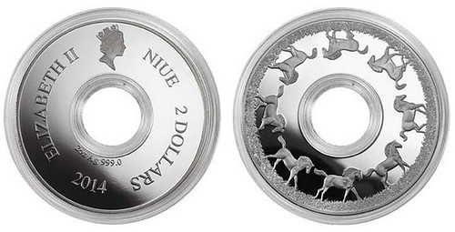
Niue Galloping Horse coin 
The Swiss coin discussed in the Coin World article is both pictorial and minimalist - the figures are flat with little detail or
relief. -Editor
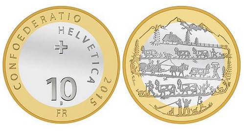
2015 Swiss Alpabfahrt coin
Here are two designs discussed last week. In each, the central element is depicted with a minimal detail. -Editor
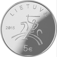 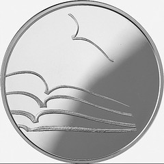
2015 Lithuania 5 Euro coin on Literature 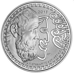 
2015 Greece 10 Euro on Aristophanes
So I don't think the Muted School and Minimalist School are the same. I can appreciate a good minimalist design when it works (I love
the Lithuanian Literature design, above) - I just don't think it works very often. I like muted designs more for their aesthetic
value and appreciate the rigor of storytelling sans words. There's nothing I dislike more than a coin or medal that’s unnecessarily
word-heavy. Reader thoughts on this topic are welcome. -Editor
To read the complete article, see:
To read the earlier E-Sylum article, see:
Wayne Homren, Editor The Numismatic Bibliomania Society is a non-profit organization promoting numismatic literature. See our web site at coinbooks.org. To submit items for publication in The E-Sylum, write to the Editor at this address: whomren@gmail.com To subscribe go to: https://my.binhost.com/lists/listinfo/esylum All Rights Reserved. NBS Home Page Contact the NBS webmaster 
|