PREV ARTICLE
NEXT ARTICLE
FULL ISSUE
PREV FULL ISSUE
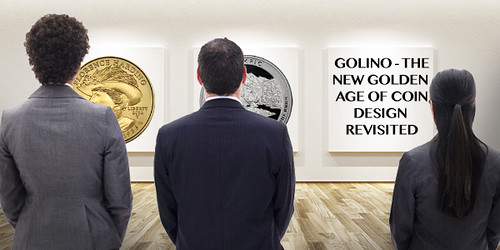
GOLINO ON MODERN U.S. COIN DESIGN
Moving from paper money design to coinage, here's an excerpt from a great article by Lou Golino for CoinWeek about the current
state of coin design in the U.S. Be sure to read the complete version online. -Editor

Perhaps few topics are more central to numismatics than the designs that appear on the coins we collect. Some people like to study mintage levels, the physical characteristics of coins and other issues, but at the end of the day it is really all, or at least mostly, about the art, as I have argued many times in this column. Coin designs are especially important when it comes to postmodern U.S. coins because most collectors and numismatists believe something is fundamentally lacking in most of the designs that have appeared on U.S. coins since 1965, when copper-nickel replaced the silver in our coinage. Back in 2012 I wrote about the effort of Edmund Moy (and really also John Mercanti, who served as Chief Sculptor-Engraver at the U.S. Mint from 2006 to 2011 though he was never confirmed by the U.S. Senate) to promote a “new golden age” in U.S. coin design. That effort was ultimately successful (if only moderately), but nonetheless failed to have a lasting impact for two reasons. First, in the years after Moy and Mercanti’s departure, there has been no real sustained effort by the Mint’s leadership to promote true excellence in coin design–though there has been some progress, which mostly comes from other actors, as I will explain. Second, the so-called new golden age was less than fully successful because its major achievements–especially the 2009 Ultra High Relief gold double eagle—were based on reusing the classic designs of our past and failed to develop new designs that are of comparable artistic quality to the old designs. The efforts of Moy and Mercanti include the introduction of many of the ongoing numismatic coin series that continue to this day such as the American Buffalo Gold coin series, which celebrates its 10th anniversary this year. In fact, the failure to do anything special in terms of design or finish for the 2016 Gold Buffalo is emblematic of the problem with U.S. coin design today. As Citizens Coinage Advisory Committee (CCAC) member Donald Scarinci succinctly noted at the March meeting of this group, “Saint-Gaudens and Weinman are dead – get over it.” So what’s happened since 2012? There have certainly been a number of solid designs, even among the commemoratives, such as the 2016 National Park Service centennial $5 gold coin designed by the Mint’s current lead sculptor-engraver, Don Everhart – or the designs of the 2015 three-coin series for the 225th anniversary of the U.S. Marshals Service. In addition, the American Platinum Eagle proof coins with changing reverse designs, which includes the half-ounce coins issued from 1998 to 2008 and the one-ounce coins issued from 1998 to present, are graced with some of the best recent designs, especially those prepared by Joel Iskowitz of the Mint’s Artistic Infusion Program, which seeks to encourage outside artists to design coins for the Mint. But for every coin with a great design issued in the past few years, there are far more that are mediocre at best.
The modern high-relief Saint-Gaudens is a delightful treat, but I'm still scratching my head over the thought of Buffalo Nickels and
Mercury Dimes in gold. Huh? I'm with Donald Scarinci - please cut out the reruns and move on. It's a new world - embrace it.
-Editor
The CCAC has been working to promote the goal of better coin designs in part through its proposal for an American Liberty high relief gold coin and silver medal series that began in 2015. Central to this effort is the idea of representing the the ethnic and racial diversity of 21st century America. But every time an image of Liberty that’s not based on Greco-Roman artistic convention is recommended by the CCAC and the Commission of Fine Arts (CFA), these groups encounter a barrage of criticism from collectors, who see the use of non-Caucasian Lady Liberties as being inspired by political correctness, or at a minimum as being artistically uninspired (if not simply unappealing). It is certainly understandable that some people simply do not find the designs proposed appealing, like, for example, the proposed design for the 2017 issue in this series, but what’s troubling is the fact that so many collectors believe it is fundamentally wrong to depict Liberty in any other way than the way she has appeared in the past. That view makes it especially difficult to create modern coins that use the allegorical depiction of Liberty as a representation of American ideals. All collectors of U.S. coins appreciate the great Liberty designs of the past, but our coinage should reflect not only timeless ideals but also the ways in which the country has changed. Otherwise, our coinage will continue to appear static.
Timeless design is about Design, not the passage of time. New designs by new artists are rarely immediately embraced by the general
public. But quality endures, if only it's given a chance. -Editor
To read the complete article, see:

Wayne Homren, Editor The Numismatic Bibliomania Society is a non-profit organization promoting numismatic literature. See our web site at coinbooks.org. To submit items for publication in The E-Sylum, write to the Editor at this address: whomren@gmail.com To subscribe go to: https://my.binhost.com/lists/listinfo/esylum All Rights Reserved. NBS Home Page Contact the NBS webmaster 
|