PREV ARTICLE
NEXT ARTICLE
FULL ISSUE
PREV FULL ISSUE
TIPS ON COIN DESIGN ORIENTATIONDick Johnson submitted these notes on how to identify the designer's intended orientation for a coin or medal image, which can sometimes be tricky for works in the round like
these. -Editor
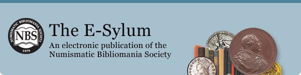
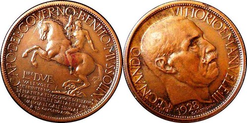 The Mussolini token illustration in last week’s E-Sylum, which Editor Wayne stated was intact and could not be oriented correctly, brought to mind the task of orientation. The human mind craves correct visual perspective, everything on the level. This is particularly so for round coins and medals which can easily be rotated out of sync. Photographers often rotate an object for better light and shadows (light from above as if the sun was shining on it). So we cannot rely on the photographer for accurate orientation - the photo must be corrected in preparation for publishing. Each side of the Mussolini token gives easy clues. The reverse, shown on the left, shows a ground line the horse is standing on, an ideal horizontal requirement. The obverse has three clues: the figures of the date should be level, the eyes should be on the same plane, and the legend begins and ends on the same horizontal point. Here are some tips identifying both horizontal and vertical clues: • Lettering and figures generally are horizontal. Having said that, when the rules are broken, an artist may create a design in mixed perspective by artistic license. Thanks, Dick. Great tips!
As for photo editing, never say never. Of course the images COULD be properly oriented, but it takes time, skill and the right tools. As it happened that item was among the last I added to last week's issue, and I was running low on time and decided to run it as-is. Yeah, it's lazy, but whaddaya want for a free internet publication? I'm glad I did though, because it generated a great discussion. Monday afternoon I was blessed with a holiday break and had some time at my home computer. Although I still have neither the skills nor software tools to do this work the right way, I did manage to reorient the images to a decent degree. I do some level of editing on many of the images in each E-Sylum issue, often just cropping or resizing. -Editor 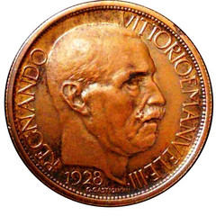  Dick adds: Excellent orientation! This was not a criticism of our kind editor, but a memory attack of the many hours pasting up photo Veloxes in auction catalog pages before computer publishing. I had to quickly learn how to orient coin and medal illustrations correctly. I shared this with reader Ron Haller-Williams who wrote in to suggest the paint.net tool for image editing. He offers the following observations. Thank you. -Editor
Caveat #1: On eBay, some people express a preference for (or insistence on) unretouched photos, so that "what you see is what you get". Not even cropping, adjustment of brightness, contrast or colour_tone (so if the lighting shows a silver coin as golden you leave it as it is!), and I'm thinking this would apply to rotation also. I don't totally agree with this, but ... Well, if the coin is in a holder I could see a reason for showing its orientation in relation to the holder, as this is part of the overall eye appeal of the complete object. The
orientation of a single coin side is meaningless - rotation must be described in relation to something else. -Editor
Caveat #2: What if you are trying to portray the effect of a "rotated die"? Interesting point. See Dick Johnson's earlier article on die alignment (linked below). For brevity cataloguers often just describe the alignment in the text in terms of
degrees of rotation. But it could be illustrated with images, where one side (probably the obverse) is oriented normally, and the other is rotated as on the coin itself. Even this is somewhat
subjective because it's not always completely evident from the coin itself what the designer intended. They don't usually include an explicit mark indicating "this is the top of the
design." Example #2 below comes close to this, though. -Editor
Caveat #3: Ignore the eyes if there are any clues to suppose that the person is doing anything other than looking ahead while standing or sitting, with the viewer (camera or artist) at the subject's eye level. Caveat #4: Horizontal/vertical lines in the picture (building sides, windows, doors, ground, exergue) and horizontal/vertical text & graphic lines would generally take precedence, where there is a clash. Note the word "generally!". These designs (all from The Netherlands) are somewhat misleading: 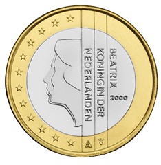 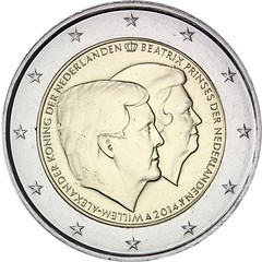 Examples 1 and 2 Example #1: The graphic lines are vertical, and the text sideways. Example #2: The best clue is the "initial mark" (crown at top-dead-centre). 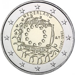 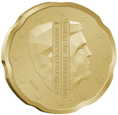 Examples 3 and 4 Example #3: "NEDERLAND" is balanced at 0.5 degrees clockwise, while the flag is "right" at 8.5 degrees clockwise. And the stars around the edge are balanced and upright with no rotation! Example #4: Again, the graphic lines are vertical, and the text sideways - but the date is skew! As Dick noted, the designer may apply artistic license to purposely create a design in mixed perspective. Thanks, everyone. Fascinating topic. -Editor
To read the earlier E-Sylum articles, see:  Wayne Homren, Editor The Numismatic Bibliomania Society is a non-profit organization promoting numismatic literature. See our web site at coinbooks.org. To submit items for publication in The E-Sylum, write to the Editor at this address: whomren@gmail.com To subscribe go to: https://my.binhost.com/lists/listinfo/esylum All Rights Reserved. NBS Home Page Contact the NBS webmaster 
|