PREV ARTICLE
NEXT ARTICLE
FULL ISSUE
PREV FULL ISSUE
MORE ON THE NEW U.S. MINT LOGOTom DeLorey writes:
 Tom's referring to the former Executive Director of the American Numismatic Association, who presided over a change in the organization's logo that had many members up in arms. The new logo ANA has since been dropped.
-Editor
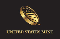
Joe Boling writes: Until the Mint's flack said "flipping in the air," I had no idea that they wanted us to see their new "coin" image that way. But that little TM at the lower right makes it obvious that the coin is NOT flipping in the air - it is tethered to a ponderous system of legalisms, not unlike their stupid (to use your word) efforts to trademark ordinary English phrases describing their programs. That little TM both distracts from and destroys its' effectiveness as a symbol, in my opinion.
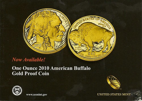
Since I used the "S" word, I'll also offer some comments on the positive side. All new designs tend to grow on you after multiple exposures. I received the below postcard from the Mint this week, and the logo shows up well against the black background. I think the flag motif is a good one. I just think they're pushing it to try depicting the "coin" flipping in the air. That's fine idea for an animated web or video image, but doesn't work so well as a static image.
-Editor

To read the earlier E-Sylum article, see:
U.S. MINT UNVEILS NEW LOGO AND MARKETING CAMPAIGN
(www.coinbooks.org/esylum_v13n34a18.html)
The Numismatic Bibliomania Society is a non-profit organization promoting numismatic literature. See our web site at coinbooks.org. To submit items for publication in The E-Sylum, write to the Editor at this address: whomren@gmail.com To subscribe go to: https://my.binhost.com/lists/listinfo/esylum All Rights Reserved. NBS Home Page Contact the NBS webmaster 
|
 Who designed the Mint's new logo? Chris Cipoletti?