PREV ARTICLE
NEXT ARTICLE
FULL ISSUE
PREV FULL ISSUE
GRAPHIC DESIGNER CRITIQUES THE JANE AUSTEN BANKNOTE
In this article, a famous graphic designer provides a review of the Bank of England's new Jane Austen note design.
-Editor
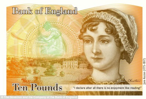
We tend not to think much about what our money looks like, but lots of us probably see the dead-president faces on our bills more often than, say, the faces of our mothers. The media frenzy surrounding England’s forthcoming Jane Austen 10-pound note has mainly focused on the successful grassroots campaign that persuaded the bank to replace Charles Darwin’s portrait with that of a female writer--and the disturbing hate-tweets that followed. But what of the actual design of the banknote? Co.Design spoke with Pentagram partner Paula Scher--the graphic designer behind plenty of iconic book jackets and the identities of everything from world-finance giants like Citibank to cultural leaders like The Public Theater--about the design of the controversial tenner. “I am delighted that the British Government is putting Jane Austen on their paper money," said Scher. "No one wrote better about women and money." The design of British paper currency in general, however, offers no such clear consensus. Its many, many visual and security elements, all packed into a few inches, include metallic thread, raised print, watermarks, an ultraviolet feature, microlettering, and holograms. In other words, the brief is a graphic designer’s nightmare. But Scher thinks it may have ultimately benefited the bill’s designer, who had to embrace the mess: “I am suspicious about money that looks too well designed. It always looks a bit counterfeit to me,” she says. “I also don’t trust well designed wine labels for more or less the same reason. It’s often the lousiest wine. So I would frame my judgement in this way: Is the paper money believable? I think the answer is yes.”
To read the complete article, see:
Designer Paula Scher Weighs In On The Jane Austen Banknote
(www.fastcodesign.com/1673140/designer-paula-scher-weighs-in-on-the-jane-austen-banknote)
The Numismatic Bibliomania Society is a non-profit organization promoting numismatic literature. See our web site at coinbooks.org. To submit items for publication in The E-Sylum, write to the Editor at this address: whomren@gmail.com To subscribe go to: https://my.binhost.com/lists/listinfo/esylum All Rights Reserved. NBS Home Page Contact the NBS webmaster 
|