PREV ARTICLE
NEXT ARTICLE
FULL ISSUE
PREV FULL ISSUE
THE STORY OF THE PRINCE GEORGE CHRISTENING COIN
Gar Travis forwarded this article from The Telegraph about the making of the Prince George christening coin. Thanks!
-Editor

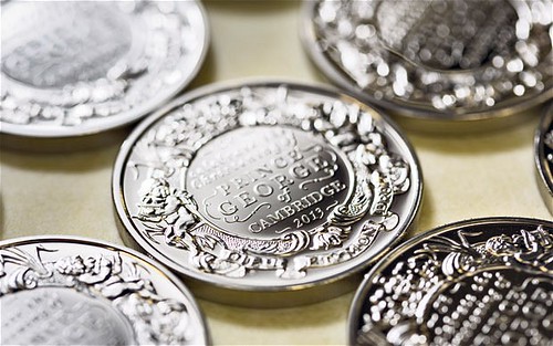
The birth of Prince George of Cambridge signals the beginning of a new generation of the modern British monarchy. Not yet three months old, he is already commanding unprecedented affection – this is the first time that commemorative coins have been produced to mark a royal christening. Of all the new coins, one stands out. Roughly the size of a saucer, it is made of a kilogram of solid gold and is worth £50,000. This is one of the largest and most expensive coins that the Royal Mint has ever produced. Just 22 are available to buy. “None of the coins I engrave are ‘just another job’,” says Gordon Summer, 47, the chief engraver at the Royal Mint. “But this is particularly auspicious. There are a number of things I’ve done that I’m proud of, but this one tops them all.” Although the Royal Mint machines normally produce 3,000 coins per hour, such is the intricacy of this design that only 100 can be produced in the same amount of time. The coins were designed by John Bergdahl, 65, who has been an engraver for 40 years. He was one of five artists invited to submit designs to the Royal Mint Advisory Committee, which is chaired by Lord Waldegrave, provost of Eton College. Bergdahl’s design was the favourite from the start. “It was a complex job as I had so little to go on,” he says. “I didn’t know the name of the baby, when it would be born or the gender. I was looking for inspiration and found an image of a silver gilt baptismal font which was commissioned by Queen Victoria in 1840 in anticipation of her first child, Victoria Adelaide Mary Louisa. It has been used to christen every royal baby since, and is kept in the Tower of London with the Crown Jewels. I took the wonderfully intricate decoration on the font and applied it to the dimensions of a coin.” The design features a pair of cherubs, an ornate cartouche supported by a lily, and a coronet befitting the heir to the throne, as well as a scroll bearing the royal motto, Dieu et mon droit. The font, which was crafted by the silversmiths E & W Smith, was inspired by the Baroque style, which was noted for its symmetry and flamboyance. By coincidence, Bergdahl explains, the style was popularised in the early 18th century – by a certain King George I. “It fitted so well,” he says. “It was very fortuitous indeed.”
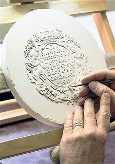
“Once we had the steel stamp, we had to return to hands,” says Summer. “The quality downgrades when it goes through a computer, and it’s not good enough for us. Every detail needs to be absolutely perfect, and that can only be achieved by hours of delicate carving using an eye-lens and a variety of hand tools.”
To read the complete article, see:
The story of the Prince George christening coin
(www.telegraph.co.uk/news/uknews/prince-george/10377085/The-story-of-the-Prince-George-christening-coin.html)
The Numismatic Bibliomania Society is a non-profit organization promoting numismatic literature. See our web site at coinbooks.org. To submit items for publication in The E-Sylum, write to the Editor at this address: whomren@gmail.com To subscribe go to: https://my.binhost.com/lists/listinfo/esylum All Rights Reserved. NBS Home Page Contact the NBS webmaster 
|
