The Numismatic Bibliomania Society

PREV ARTICLE       NEXT ARTICLE       FULL ISSUE       PREV FULL ISSUE      

V16 2013 INDEX       E-SYLUM ARCHIVE

The E-Sylum: Volume 16, Number 51, December 15, 2013, Article 17

2014 AMERICAN PLATINUM EAGLE DESIGN THOUGHTS

We had no takers on my challenge last week to critique the design candidates for the 2014 American Platinum Eagle. So here are my thoughts. -Editor
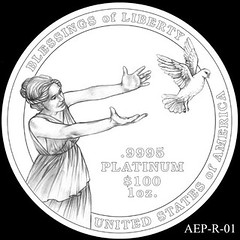
2014 American Eagle Platinum design AEP_R_01 1 - I like this one. I like how it shows movement and embodies the concept of freedom as a freed bird. It's uncluttered and I also like how the figures break the circle of the rim. The design pops out, although I would worry that such an unbalanced design would strike up well.


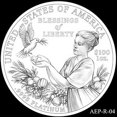
2014 American Eagle Platinum design AEP_R_04 4 - I'm indifferent to this one. It's nicely rendered, but embodies the "Blessings" more than "Liberty" - design 1 does that much better. I'd have to agree that the bounty is too bountiful.


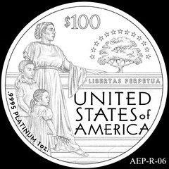
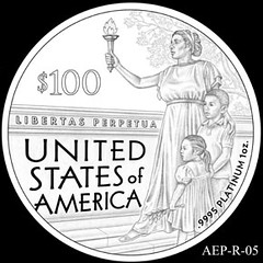
2014 American Eagle Platinum design AEP_R_05 2014 American Eagle Platinum design AEP_R_06

5,6 - Number 5 is much better than 6; the group of figures stops the eye and frames the scene. The foot is just plain wrong. But as a design concept it's not bad, and a good engraver could execute it well.

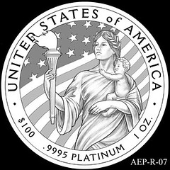
2014 American Eagle Platinum design AEP_R_07 7 - I'm indifferent to this one, too.


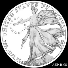
2014 American Eagle Platinum design AEP_R_08 8 - I like the main figure a lot (it wowed me), but it seems too isolated. There's nothing to indicate where she is, where she might be going, or what she might be looking at. I like uncluttered designs, but this may be too uncluttered.


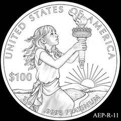
2014 American Eagle Platinum design AEP_R_11 11 - I was impressed with this one. I like the concept of the child and the torch, which to me evokes a young Statue of Liberty. Her expression is hopeful and apprehensive at the same time, which is very appropriate for the difficult journey of Liberty. I think that the landscape is lame - too plain and formulaic. But I like the concept a lot and would say it's my favorite. But I don't think a good engraver could rescue the landscape - it needs a better design.


If I had to rank these, I would pick 11, 1, 8,7, 5,4, 6. As it turns out, the Citizens Coinage Advisory Committee (CCAC) liked #11 too.

To read the CCAC's comments, See: CCAC Review of 2014 American Platinum Eagle Designs (news.coinupdate.com/ccac-review-of-american-platinum-eagle-designs-3043/)

To read the earlier E-Sylum article, see: 2014 AMERICAN PLATINUM EAGLE DESIGNS (www.coinbooks.org/esylum_v16n50a11.html)

Wayne Homren, Editor

Google
 
NBS (coinbooks.org) Web

The Numismatic Bibliomania Society is a non-profit organization promoting numismatic literature. See our web site at coinbooks.org.

To submit items for publication in The E-Sylum, write to the Editor at this address: whomren@gmail.com

To subscribe go to: https://my.binhost.com/lists/listinfo/esylum

PREV ARTICLE       NEXT ARTICLE       FULL ISSUE       PREV FULL ISSUE      

V16 2013 INDEX       E-SYLUM ARCHIVE

Copyright © 1998 - 2024 The Numismatic Bibliomania Society (NBS)
All Rights Reserved.

NBS Home Page
Contact the NBS webmaster
coin