PREV ARTICLE
NEXT ARTICLE
FULL ISSUE
PREV FULL ISSUE
LINCOLN CENT TYPOGRAPHY DESIGN HISTORY
Eric Schena forwarded this interesting April 22, 2014 Slate article about the typography of lettering on the classic Lincoln cent.
-Editor
Over the past 25 years, Tobias Frere-Jones has created some of the world’s most widely used typefaces. He has taught at the Yale University School of Art since 1996, gives lectures around the world, and has work in the permanent collections of the Victoria & Albert Museum in London and the Museum of Modern Art in New York. Here at the Eye, Frere-Jones is sharing a post from his new blog, a typographer's history and appreciation of the design of the lowly penny. The lowly penny, more clinically known as the “one-cent piece,” has a history of lettering all to itself.
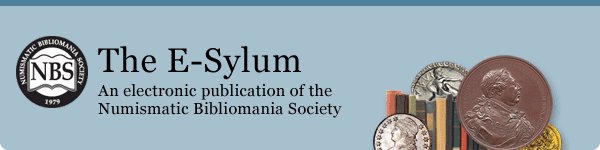
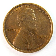
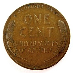
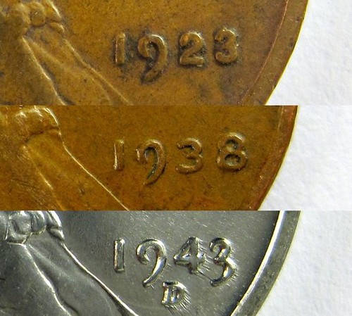
Coins are normally a job for sculptors, and President Theodore Roosevelt chose Victor David Brenner to design a new penny to celebrate the centennial of Lincoln’s birth in 1909. The new coin broke from the tradition of allegorical figures and depicted a specific person for the first time. Such practice had been explicitly avoided since independence, because many felt it tasted too much like the monarchy they had left behind. It seemed that Lincoln’s 100th birthday was the right time to drop the prohibition, and now we find it hard to imagine American currency without presidents. The design process was marred by tension between Brenner and U.S. Mint Engraver Charles Barber, who had designed earlier coins and likely felt he should have received this commission himself. While proofing the design, Barber and Mint Director Frank Leach shifted Lincoln’s portrait towards the center of the coin, where the detail could be best rendered in striking. Troubled by the blank space above Lincoln’s head, they decided to add “IN GOD WE TRUST” along the top edge. This motto had appeared on U.S. coins for years, so Brenner could not have been surprised at its inclusion, but I can’t imagine he was happy about the tampering. The lettering records the dissonance between the artist and his client. The “1909” figures are calmly rendered, and suggest a tool driven through clay or plaster. With awkward shapes and erratic spacing, the motto looks more like a part number brusquely stamped in. The motto would not get fixed for 60 years, after 55 billion coins had been produced. The reverse of Brenner’s design is a beautifully balanced mass of lettering framed by sheaves of wheat, epic and quaint in the same breath. It is the pocket-sized monument that coins are meant to be, speaking for the ages from the vantage of 1909. The craft afforded here also belies the fact that this is the country’s smallest denomination. Brenner’s wheat sheaf design would also be the last time that lettering featured so prominently in U.S. coinage. It remained for 50 years, until Frank Gasparro’s rendition of the Lincoln memorial replaced it in 1959, to mark the sesquicentennial of Lincoln’s birth. It’s not clear who updated the dies from one year to the next, though it seems obvious enough that different hands and tastes were involved. And yes, I was nuts to collect enough pennies so I could track this. Some years feature clenched shapes and tight spacing, others return to Brenner’s airy dignity. In 1934, the figure 3 is rendered with a descending end stroke. This “oldstyle” form vanishes for the rest of the ’30s, and then reappears in 1943.
To read the complete article, see:
A Typographer’s Design History of the Unappreciated Penny
(www.slate.com/blogs/the_eye/2014/04/23/
To read the Frere-Jones' original blog post, see:
Pennyspotting
(www.frerejones.com/blog/pennyspotting/)
The Numismatic Bibliomania Society is a non-profit organization promoting numismatic literature. See our web site at coinbooks.org. To submit items for publication in The E-Sylum, write to the Editor at this address: whomren@gmail.com To subscribe go to: https://my.binhost.com/lists/listinfo/esylum All Rights Reserved. NBS Home Page Contact the NBS webmaster 
|