
PREV ARTICLE
NEXT ARTICLE
FULL ISSUE
PREV FULL ISSUE
NEW YORK FALLEN HEROES OF 9/11 MEDAL DESIGNS
Here are my thoughts on some more candidate designs from the U.S. Mint.
-Editor
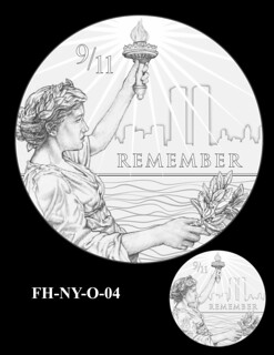
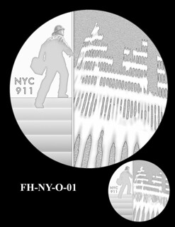
I think I like the one on the left even though it closely mimics the earlier 9/11 memorial medal. But I don’t think the ghost outline of the city works. The design on the right is ghostly as well and I get it, but I still don't like it.
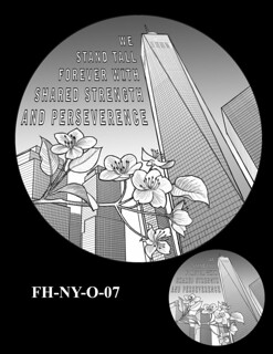
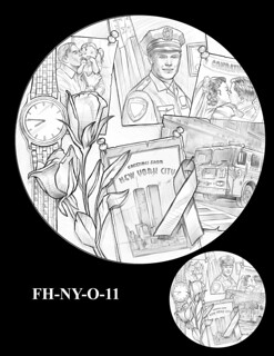
I like that the one on the left pictures the new office tower on the site, although I think the wording is superfluous - the image says it all. I like this the best of the proposed designs - I think it makes a good bookend to the earlier medal, kind of a before/after pair. As for the one of the right, I get the sentiment expressed by the photo collage left by loved ones at the site, but the motif just doesn’t work on a coin - it's too busy and crowded. Here are a couple reverse designs.
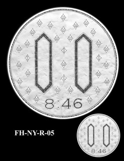
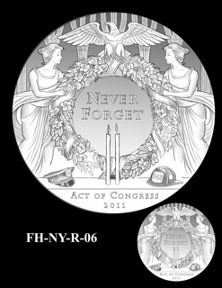
What were they THINKING with the one on the left - yikes!
The one on the right I like a lot. The pair of candles eloquently evokes the Twin Towers, and the policeman's and fireman's helmets are an understated representation of the fallen first responders. The wreath may be a little too busy, but overall I think the design works well.
The Numismatic Bibliomania Society is a non-profit organization promoting numismatic literature. See our web site at coinbooks.org. To submit items for publication in The E-Sylum, write to the Editor at this address: whomren@gmail.com To subscribe go to: https://my.binhost.com/lists/listinfo/esylum All Rights Reserved. NBS Home Page Contact the NBS webmaster 
|