PREV ARTICLE
NEXT ARTICLE
FULL ISSUE
PREV FULL ISSUE
MORE ON OCR AND NON-LINEAR LEGEND ORIENTATIONSInspired by questions from Bruce Smith and Dr. Greg Brunk, last week we explored
Optical Character Recognition (OCR) and the problem of curved coin legends and their different
orientations. -Editor
Dr Kavan Ratnatunga passes along a great tip for a technological solution that exists today to address the curvature problem. He writes: Your query on OCR of coin text reminds me of an encounter I had with Prof Raj Reddy who was Dean of Computer Science at CMU. Having developed automated image analysis software for the NASA Hubble Space Telescope, I wanted to interest him in adapting it for OCR, when he was launching a project to scan a Million Books. I took him a book on Hindoostan published in 1822, to get his interest and to illustrate the difficulty of OCR on old text. He said, "Give me a photo copy, I will get it typed up in India." Raj was a very nice guy and very practical when needing to get a job done. Because coins have so little text and more complex backgrounds, the human eye is still more efficient for reading and typing it. That said, one can easily solve the non-linear aspect of rim text particularly for illustration as I did over 10 years ago and describe in an article on my web site. In PhotoShop, I use the Polar to Rectangular transformation which in my basic PhotoShope Elements is under filter - Distort - Polar Coordinates. After the transformation you need to just stretch the image width by a factor of two (and rotate by 180 degrees if needed). You will clearly need 600 dpi or higher image scans of the coins, not the low resolution images you have posted. But I have attached transformed images for illustration. I knew Raj Reddy as well, having worked at one of the companies he started in
Pittsburgh, Carnegie Group, Inc. Ten years on, he may still be right about it being more practical
to do this with human effort. But it's fun to explore the possibilities, and Kavan's
solution is a key part of the puzzle.
OK, here are the two coin images from last week, and below them are Kavan's transformed images, where the legend text is straightened out. Because we started with low-resolution images the text isn't readable, but this illustrates the general principle. Because the second coin has an outer-oriented legend, we've flipped the resulting image 180 degrees. Is this cool, or what? -Editor 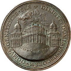 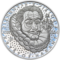
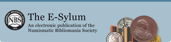
Inner- (left) and Outer-orientation (right) 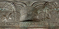 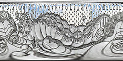
Transformed images with the legends straightened out Getting back to the ORIENTATION of legends, here's what Bruce Smith originally asked: When a coin or medal has an inscription running in the border or near the edge of the flan, the bottoms of all the letters may point inward, OR they may point outward, OR the top inscription may have the letters pointing inward and the bottom inscription will have the letters pointing outward. Is there a term for these different orientations? To which I later wrote: Maybe it's time to invent proper terms. A bellybutton is either an innie or an outie. Maybe those could be the shorthand terms for non-linear (not in a straight line) legend orientations, such as inner-, outer- and mixed-orientation text legends. Any thoughts or suggestions? Below are reference images of coins with inner- and outer- orientations from the earlier article. -Editor In an email response titled "Legendermania", Harry Waterson writes: I have been waiting with 'copy and paste' just strokes away to learn the proper way to describe the letter orientation of a legend on a coin or medal. It seems to me there must be some shorthand in the medal striking community to describe an 'innie' or an 'outie.' To keep the topic alive and having given it a thunk, here are some thoughts;
So let's dip into typography and remembering that we are usually dealing with caps, i want to call the normal, common legend "upper and lower caps" or abbreviate it to U/L Caps.
Legends with an inner or outer orientation usually go full-circle around the medal and represent one continuous thought. So by extension these could be described as U-Caps or L-Caps. To further reduce the abbreviation to catalog speak: Leg.(U/L) or Leg.(UC) or Leg.(LC) or Leg (U-C) or Leg (L-C) Of course the explanation of all this in the front of the catalog would probably take up more space than just dealing with the issue on a case by case basis. Upper or lower. Or there is the clock face option. A normal legend could be described as 9-3 over 8-4. An U-Cap legend could be 12369. an L-Cap could be 12369 (italics to indicate an L-Cap). Using the clock face has the added advantage of telling the reader where normal two parts of a legend start and end. And where a continuous legend starts. For the Latin classicist this system could be transliterated from Arabic to Roman numerals. Greek classicists are on their own. Gen-Xers who get their time digitally might find this option daunting. Then there is the NorthSouthEastWest (GPS) convention. NS is the normal, common, garden variety legend combo. NESW is the full circle legend with top-of-letters out and conversely NWSE is top-of-letter in. This would probably work better at a bridge table. NEWS would mean West has gone out of turn. Or just a News Flash that the dummy couldn't count.. How about a little symbolism. Just pick a symbol and assign a format, i.e. Spades Hearts Diamonds Clubs
Anybody feeling flush yet? I could go on all day
I'm not sure I want to follow Harry down that rabbit-hole. But this sure
turned out to be an interesting topic. Who knew? Thanks, everyone. -Editor
To read Kavan's article, see:
To read the earlier E-Sylum article, see:
Wayne Homren, Editor The Numismatic Bibliomania Society is a non-profit organization promoting numismatic literature. See our web site at coinbooks.org. To submit items for publication in The E-Sylum, write to the Editor at this address: whomren@gmail.com To subscribe go to: https://my.binhost.com/lists/listinfo/esylum All Rights Reserved. NBS Home Page Contact the NBS webmaster 
|