
PREV ARTICLE
NEXT ARTICLE
FULL ISSUE
PREV FULL ISSUE
NORWAY'S NEW PIXEL BANKNOTESHeather Schena forward this item about new designs for Norway's banknotes.
Thanks! We knew money was going digital, but didn't expect the revolution to look like this...
-Editor
Believe it or not, this is Norway’s new currency design, set to be released in 2017. The backsides of their controversial new banknotes feature color palettes that look like digitally blurred versions of the images found on the fronts of the bills. Both sides of the bills were selected by Norges Bank during a competition held in the spring of 2014. The front side contains a series of artwork by graphic design studio The Metric System and Terje Tønnessen called “Norwegian Living Space,” while the pixelated back features a series called “Ripple Effects” by Enzo Finger. The front features various ocean scenes of importance to the Norwegian national identity. 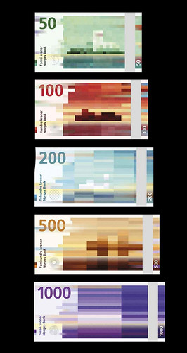 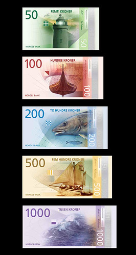 To read the complete article, see:
Here's another article from a design publication with more information.
-Editor
Norges Bank has announced that designs by two Oslo studios have been chosen to feature on Norway's new banknotes, which will come into circulation in 2017. Snøhetta's design for the reverse of the notes features a pixellated image of the country's coastline, the amount of distortion depicting the wind speed as it whips up with each denomination... Earlier this year, eight designers were invited to submit proposals for Norway's new banknote design on the theme of 'the sea'. Today, the central bank of Norway announced that designs by The Metric System and Snøhetta will be used on the obverse (full set shown bottom of post) and reverse sides of the banknotes, respectively. Snøhetta's design, 'Beauty of Boundaries', renders images from the Norwegian coastal landscape in a mosaic-like pixellated form. Using a modern visual langauge, say the studio, they aimed to respresent where the sea and land meet, reflecting the communities which thrive on the coast. According to the Norges Bank catalogue accompanying an exhibition of the shortlisted work, the patterns generated on the studio's designs for the reverse refer to the Beaufort wind force scale. On the 50 kroner denomination the wind is weak, so the image is rendered in short, square shapes; while on the 1,000 kroner note the wind is strong, creating longer, stretched-out forms and – while difficult to discern in the images shown here – choppier waves in the water. It's such a refreshing idea and reminded us of the kind of attention to detail on show in the work of the great 'Ootje' Oxenaar, who designed the Dutch banknotes in the late 1960s – and often included 'personal' touches in the designs, to the annoyance of the Dutch Central Bank. 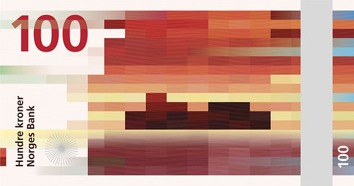 To read the complete article, see:
 Wayne Homren, Editor The Numismatic Bibliomania Society is a non-profit organization promoting numismatic literature. See our web site at coinbooks.org. To submit items for publication in The E-Sylum, write to the Editor at this address: whomren@gmail.com To subscribe go to: https://my.binhost.com/lists/listinfo/esylum All Rights Reserved. NBS Home Page Contact the NBS webmaster 
|