PREV ARTICLE
NEXT ARTICLE
FULL ISSUE
PREV FULL ISSUE
HOW LOVE TOKEN ENGRAVING STYLES CHANGEDCarol Bastable is the President and webmaster of the Love Token Society and also writes for the society's newsletter, Love letter. She writes: I recently researched a Victorian period book on engraving and discovered some information. It confirmed some of my previous research on love token initials which had been based on observations over time and population studies.
Carol kindly forwarded a copy of the August 2015 Love Letter, which includes her article, Late Date Love Token Design and
Monograms. Thanks! Here's an excerpt. -Editor
I recently saw an antique engraving book on eBay and thought how interesting it would be to read and research its history, so I purchased it. The book “Modern Letter Engraving” was written by Fred Holmes Rees. and published in 1898. A number of the early chapters take the reader through engraving the same script font, letter by letter, in both upper and lower case, and address spacing between letters. There was one page on flourish design which followed the chapters on individual letter engraving. “Flourishes” are the squiggle lines that are used to decorate outside of the letters and give a decorative effect to the background area.
There are several pictures of highly ornate ciphers and monograms shown in the last five chapters of the book. Some are akin to love token design and some are possibly even more ornate than what is seen on love tokens. Chapter 29 covers block letter monograms. These are what love token collectors have been calling double and triple overlapping letters. Perhaps we should adjust our term and embrace the correct one as written in the book, “block monograms”. That being said, much of what we have been calling monograms (made using overlapping script letters) are also referred to a little differently with the words “cipher” and “script monograms”.
All in all, the book was interesting and it really gives a love token collector an appreciation for all the work that goes into designing and engraving a monogram. I was hoping for even more clues to love tokens and found myself quickly skimming though the sections on how to engrave individual letters A-Z. The idea of searching for and reading old engraving books is an interesting prospect. Next time maybe a book published in the late 1870’s or early 1880’s, provided one exists, would be even more fruitful.
At my request Carol provided some examples of the different Love Token lettering styles. Thanks! -Editor
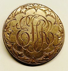 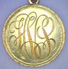
Script Style Cipher Love Token Designs on a Peace Dollar and Quarter Eagle 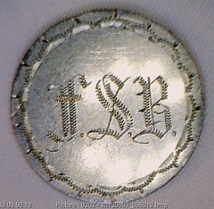 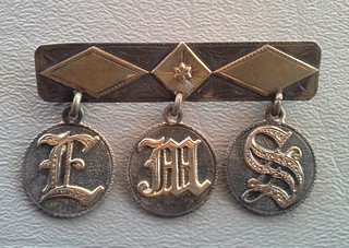
Old English Love Tokens Designs on a Shield Nickel and Dimes (Gold Overlay) 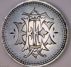 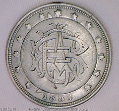
Block Letter Love Token Designs on a Bust Half and Liberty Nickel Carol adds: A cipher does not overlap as fully as a monogram. The block letters are stacked one on top of another and in the cipher, one can place the order as two letters appear just left and right of the center one. Victorian block letters are far more ornate than what we think of today as block letters.
It's important for the hobby to get its terminology correct, and aligning our descriptions with those used by the makers of Love
Tokens is a useful step. But manufacturers and collectors are different breeds of animals, and a perfect alignment may not be possible.
But connecting with the makers through these contemporary writings is an ideal first step. Kudos to Carol for finding this information
and bringing it to the attention of the numismatic community. Do any of our readers know of other books on the topic that may shed
additional light on the issue? -Editor
To read the book on Google Books, see:
For more information on the Love Token Society, see:
Wayne Homren, Editor The Numismatic Bibliomania Society is a non-profit organization promoting numismatic literature. See our web site at coinbooks.org. To submit items for publication in The E-Sylum, write to the Editor at this address: whomren@gmail.com To subscribe go to: https://my.binhost.com/lists/listinfo/esylum All Rights Reserved. NBS Home Page Contact the NBS webmaster 
|
