PREV ARTICLE
NEXT ARTICLE
FULL ISSUE
PREV FULL ISSUE
KRUGERRAND FONT WINS AWARDI've been wanting to mention this great October 4, 2017 Coin Update article by Brandon Christopher Hall about an obscure but interesting numismatic topic - letter styles
on coins. Here's an excerpt. Be sure to see the complete article (with more illustration) online. -Editor
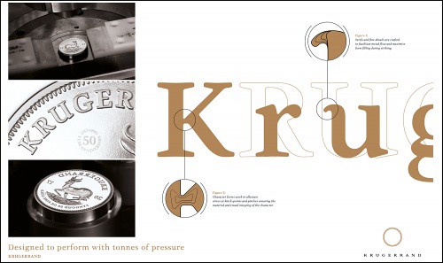 In the medallic arts, additional considerations come into play. The type must convey both the necessary information and the mood of the design, all while being readable at a very tiny size. (For a raft of examples, check out the Twitter hashtag #FontsOnCoins.) In contrast to the Papyrus font blunder in Avatar, the South African Mint announced in August that the font on its silver Krugerrand had won a Craft Award for typography in the Loeries, a renowned series that awards excellence in the communications industry in Africa and the Middle East. 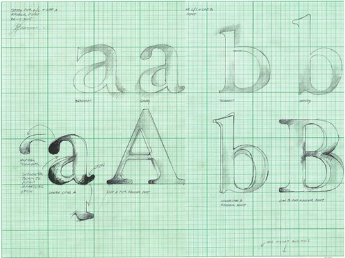 The mint had asked Jan Erasmus, one of the top designers in South Africa, to create a font family for the 50th anniversary of the Krugerrand, the world’s first bullion coin. The new font would be used not only on the coins but on the related marketing materials. Erasmus opted to recut the Krugerrand’s original font, a classic known as “Goudy Old Style.” The result was a medium-contrast set of characters, with soft corners and straight edges for a crisper appearance: 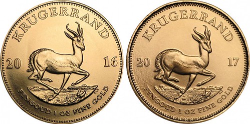 The original and updated typefaces The apertures (for example, the hollows within the letters “b” and “d”) are more open, to prevent their being filled in by the flow of metal during striking. Pains were taken to ensure the new font could be struck into a planchet at a minuscule 3-point size under 150 tons of pressure. Erasmus’s attention to detail, consideration for the collector, and creativity not only produced a successful font — which is now seen on millions of 50th-anniversary Krugerrand coins around the world — but earned the South African Mint a well-deserved Craft Award and heaps of praise. To read the complete article, see:  Wayne Homren, Editor The Numismatic Bibliomania Society is a non-profit organization promoting numismatic literature. See our web site at coinbooks.org. To submit items for publication in The E-Sylum, write to the Editor at this address: whomren@gmail.com To subscribe go to: https://my.binhost.com/lists/listinfo/esylum All Rights Reserved. NBS Home Page Contact the NBS webmaster 
|