PREV ARTICLE
NEXT ARTICLE
FULL ISSUE
PREV FULL ISSUE
BANKNOTE DESIGN AT NORGES BANKThe Nordic central bank recently revamped its banknotes and along the way, its entire banknote design process. This article from the Central Banking -Editor
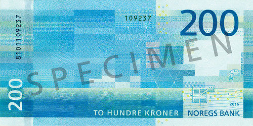
 When Norges Bank started drafting plans for a new banknote series back in 2012, no-one could have predicted governor Øystein Olsen would appear in a cameo role alongside three men dressed in yellow raincoats holding fish in a promotional music video. But it perhaps should not have come as a surprise, since staff at the Norwegian central bank also adopted a philosophy to break many design principles as they set about introducing a new series of banknotes. While Norway does not have – and never has had – a systemic counterfeit problem, its previous series of notes was beginning to show signs of age, in terms of security. “Our counterfeiting numbers were low, but our neighbouring countries were renewing their banknotes to increase security, and we had to follow suit,” says Trond Eklund, director of Norges Bank’s cashier’s department. “Confidence is the cornerstone of the monetary system and we need the public to be confident in our banknotes.” The banknote department decided upon the theme of ‘the sea’ relatively quickly. “The ocean has always [shaped] – and will continue to shape – the identity of our nation, and so it was a natural choice for us,” says Eklund. Five banknotes were to be printed, so five subthemes were created to aid the design process of juxtaposing how the sea has brought economic prosperity to the Nordic nation. Banknote designs tend to be based on simple pictures. Some, such as Swiss banknotes, are drawn using computer-aided design tools. Norges Bank, on the other hand, has a tradition of converting designs freehand into line drawings. For the Nkr100 note, one of the two banknotes to be released into circulation in 2017, former Norges Bank banknote designer Sverre Morken was brought in to convert Metric’s longboat design. “Banknotes are a form of graphic art,” says Morken. “I spent around 160 hours drawing the design.”  But while the fronts of the notes are steeped in tradition, the reverse sides of the notes tell a very different tale. “When we were deciding what the back of the banknotes would look like, we decided not to use Metric’s proposed design. Instead, we used the proposed fronts from [architecture studio] Snøhetta. In this way, we formed a combination of traditional and modern expression,” says Eklund. Through experimentation with other submissions, Snøhetta’s stood out as a clear winner. Enhanced security features have been integrated into the maritime designs. Metallic and colour-changing holograms have been used to the form of anchor chains and rings symbolising ripples in the water. Meanwhile, puffins appear as watermarks and small images only visible under ultraviolet light. The central bank has also integrated a security thread, micro-lettering, iridescent elements into the banknotes. To read the complete article, see: Wayne Homren, Editor The Numismatic Bibliomania Society is a non-profit organization promoting numismatic literature. See our web site at coinbooks.org. To submit items for publication in The E-Sylum, write to the Editor at this address: whomren@gmail.com To subscribe go to: https://my.binhost.com/lists/listinfo/esylum All Rights Reserved. NBS Home Page Contact the NBS webmaster 
|