PREV ARTICLE
NEXT ARTICLE
FULL ISSUE
PREV FULL ISSUE
DICK JOHNSON ON THE 2018 WINTER OLYMPIC MEDALSDick Johnson submitted these thoughts on the designs of the 2018 Winter Olympic medals. Thanks. -Editor
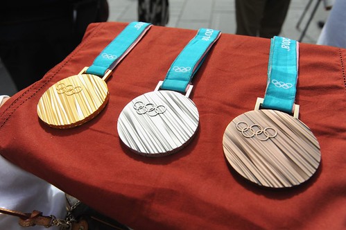
 OLYMPIC MEDAL DESIGN A TRAVESTY To the makers of the 2018 Winter Olympic medals credit, the alternating gold and silver striation design is a touch of allure. It has the cost benefit of using less plated gold than what would be necessary had the entire surface been goldplated. This is applicable only to the gold Medals; the silver and bronze versions are solid unplated. Overall, however, the design is a disappointment. The medal’s creator stated the design indicates tree bark. How is this appropriate to the Olympic events? – or the winter season? The striated design of multiple streaks is a textural treatment. As such it is minimal art, the complete opposite of the basic characteristics of art medals which relish detail. Previous Olympic medals followed this tenet with detailed designs significant to the Olympic events. Let us hope future Olympic medal designers don’t carry this trend forward. If so the result would be the five Olympic ring symbol, about as minimal as could be depicted on the official medals. To read the earlier E-Sylum article, see: Wayne Homren, Editor The Numismatic Bibliomania Society is a non-profit organization promoting numismatic literature. See our web site at coinbooks.org. To submit items for publication in The E-Sylum, write to the Editor at this address: whomren@gmail.com To subscribe go to: https://my.binhost.com/lists/listinfo/esylum All Rights Reserved. NBS Home Page Contact the NBS webmaster 
|