PREV ARTICLE
NEXT ARTICLE
FULL ISSUE
PREV FULL ISSUE
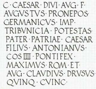
ROMAN IMPERIAL COIN LETTERINGMike Marotta passed along this Coin Talk discussion board post on Roman Imperial coin lettering. Thanks! Here's a short excerpt - be sure to read the complete article online. -Editor Being a Calligrapher, I have always admired the letterforms employed by the artisan engravers of Imperial Rome on monuments, tombstones, edifices - and coins. 
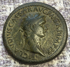
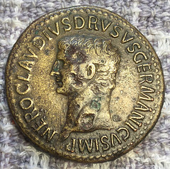
I particularly admire the Inscriptional lettering on the sestertii of the Julio-Claudian Emperors - especially those of Caius (Caligula), Claudius and Nero. The large flans permit elegant letter formation and, in my opinion, the die engravers of that period were especially skilled in rendering very elegant lettering. I eagerly seek out sestertii that have clear and complete inscriptions - the overall coin condition is of secondary importance for me. I have included photos of such coins in this post 
Roman Imperial coin inscriptional letterforms are based on those of CAPITALIS MONUMENTALIS employed by stone cutters for edifices, monuments, tombstones, etc. A fine extant example is found on Trajan's column in Rome and the essential constructs of these letterforms are the models for all Majuscule (Capital) alphabets used in the western world. Stone cutters in particular still employ their distinctive proportions and terminating serifs. 
It should be noted that only twenty letters were normally used in the ancient Roman alphabet: A B C D E F G H I L M N O P Q R S T V X. Our modern J and U were not used, their equivalents being I and V respectively. Thus, our modern JULIUS was written IVLIVS. The letter K was seldom used and then only before A. The letters Y and Z were only used when reproducing Greek words. W was not part of the ancient Roman alphabet at all. It was Medieval scribes who formalized the construction models for the letters J K U W Y Z.
To read the complete article, see:
I thought of coin lettering when I came across this article on the Letterform Archive of graphic design items. Coins were probably the original graphic design items long before the term was invented. -Editor San Francisco's Letterform Archive, founded in 2015 by collector Rob Saunders, houses a collection of over 60,000 graphic design items, from as early as 900 CE (labeled "Exodus Manuscript Fragment as Binding") to as recent as 2019 (a monograph on designer Jennifer Morla published by Letterform Archive). Letterform, which has been open to the public since its inception, has been expanding the archive's audience through public lectures and workshops, in addition to its postgraduate certificate program in type design. In early April, it went a step further by opening the archive digitally to the public, expanding its reach and availability of its materials — a project long in the making that just happened to coincide with the closure of public spaces across the globe due to the spread of COVID-19.
To read the complete article, see:
Wayne Homren, Editor The Numismatic Bibliomania Society is a non-profit organization promoting numismatic literature. See our web site at coinbooks.org. To submit items for publication in The E-Sylum, write to the Editor at this address: whomren@gmail.com To subscribe go to: https://my.binhost.com/lists/listinfo/esylum All Rights Reserved. NBS Home Page Contact the NBS webmaster 
|