PREV ARTICLE
NEXT ARTICLE
FULL ISSUE
PREV FULL ISSUE
V25 2022 INDEX E-SYLUM ARCHIVE FRASER'S FLIP AND MODERN LOGO DESIGNThe portrait change on the 2022 U.S. quarters parallels a shift in the design of corporate logos, according to this Fast Company article. -Editor 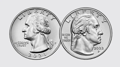
One change to the U.S. quarter this year has gone mostly unnoticed. The portrait of George Washington on the coin, which had faced left since its first appearance in 1932, flipped to face right in 2022. Based on internet chatter, the recent barely-perceptible tweak to Instagram's logo attracted much more attention. But the about-face on the quarter reflects a large trend in American logo design over the past century. The new portrayal of Washington is a design by American sculptor Laura Gardin Fraser that had been recommended in 1931 to adorn the coin, but was snubbed in favor of John Flanagan's left-facing offering. Somewhat ironically, Fraser's Washington appears more masculine and less fussy than Flanagan's.
These ancient heraldic rules tripped up some American companies. In 1925, Graybar Electric, a Midwestern company that sells telecommunications equipment, discovered to its horror that the line on its shield logo was tilted the wrong way, making it a Unlike the shields of heraldry, companies also placed emphasis on how logos appeared to the viewer, rather than the user. For instance, Apple discovered that while its logo on its laptops would face the user when they opened the computer, it would then appear upside-down to onlookers. So, the company subsequently flipped the symbol. Today, there are some notable logos, particularly those depicting birds, that still uphold the heraldic leftward tradition: Lufthansa, Tottenham Hotspur, Japan Airlines, the Philadelphia Eagles (the only left-facing National Football League symbol). 
But in general, right-facing logos now predominate. Of the 62 Fortune 500 logos that can be said to be facing or moving laterally, 82% go right. It's the left-facing exceptions that are interesting. Some, like Goodyear and John Deere, have been leftward for over a century. But others, like Aflac's duck and building materials supplier Builders Firstsource's leaning
To read the complete article, see:
To read earlier E-Sylum articles, see:

Wayne Homren, Editor The Numismatic Bibliomania Society is a non-profit organization promoting numismatic literature. See our web site at coinbooks.org. To submit items for publication in The E-Sylum, write to the Editor at this address: whomren@gmail.com To subscribe go to: https://my.binhost.com/lists/listinfo/esylum All Rights Reserved. NBS Home Page Contact the NBS webmaster 
|