PREV ARTICLE
FULL ISSUE
PREV FULL ISSUE
V25 2022 INDEX E-SYLUM ARCHIVE THE BIRDS OF CANADA BANK NOTESAnother Bank of Canada Museum article discusses technical aspects of the Birds of Canada bank note series. Here's an excerpt. -Editor
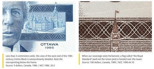
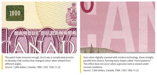
Birds have appeared on currency for two millennia. And today, a number of nations feature birds on every one of their bank notes. But type The bank notes of the Scenes of Canada series were complicated things and represented the latest in security printing technology. Their finely detailed vignettes, elaborate geometric patterns and multiple colours were designed to make these notes as difficult as possible to counterfeit. Indeed, each bill required from four to eight different printing plates. But technology was about to slip a new item into the counterfeiter's toolbox—colour photocopiers. With one of those, a clever crook could deal with most of the Scenes of Canada security features with a single stroke. While some denominations of the Scenes of Canada series were still in production, the Bank asked the security printing firm of Thomas de la Rue (now De La Rue) to begin planning a whole new note series that would counter this new threat. The result was a complete about-face from the philosophy behind recent security printing. If photocopiers could easily handle the colours and elaborate designs of the current series, then the next series should be bold and simple—the better to spot the boo-boos that this new technology would inevitably make. In 1977, De La Rue provided its first design proposals, still with landscapes on the back. In 1983, much cleaner and simpler vignettes were suggested, ones with a single, large focal point—birds. They were beautiful, popular and extremely unlikely to generate controversy. Who could possibly have an issue with a bird? Each bird and its accompanying background had to broadly reflect Canada, so nothing too specific to any one region was chosen. Though snowy owls are uncommon in southern Ontario and kingfishers are equally unusual in the North, the habitats of both are vast, big enough to represent much of the nation. And Canada geese and robins are as common as squirrels almost everywhere. The intent was for the birds to at least complement the colour themes of their chosen notes, if not actually match them. Despite the overall philosophy of using large, clear elements, the Bird series notes all carried some very subtle imagery—little gifts for the very observant. To the right of each portrait was a highly detailed little gem: a tiny image of the Parliament Buildings. Each view is tailored to suit the era of the person featured. Consequently, alongside Sir John A. Macdonald and Sir Wilfrid Laurier are images of the original 1862 buildings. There are even wee little historically correct flags (roughly 1 millimetre long) flying from the towers. But while Sir Robert Borden was Prime Minister (1911–20), Centre Block burned to the ground. Though it might have thrilled historians, it would have been rather inappropriate to place an image of a smoking ruin next to Borden. Instead, the reconstructed Centre Block, begun while Borden was in office, is shown. As a historical compromise, the flag flying from the Peace Tower is the British Union Jack. That seems odd, but throughout the First World War, a Union Jack flew over Parliament to show solidarity with Great Britain. These notes were far more technically advanced than the Scenes of Canada notes. As another defence against new and future imaging technologies, the large-denomination notes each featured a little metallic patch. Though highly reflective when seen from an angle, these optical security devices do not reflect light when viewed directly. So, when scanned or photocopied, the patch would show up as nearly black. The patches were a Canadian invention that a number of other countries later adopted.
On the back of the notes, the word Also found via News & Notes from the Society of Paper Money Collectors (Volume VIII, Number 6, July 26, 2022). -Editor
To read the complete article, see:
Wayne Homren, Editor The Numismatic Bibliomania Society is a non-profit organization promoting numismatic literature. See our web site at coinbooks.org. To submit items for publication in The E-Sylum, write to the Editor at this address: whomren@gmail.com To subscribe go to: https://my.binhost.com/lists/listinfo/esylum All Rights Reserved. NBS Home Page Contact the NBS webmaster 
|


