PREV ARTICLE
NEXT ARTICLE
FULL ISSUE
PREV FULL ISSUE
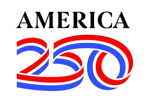
SEMIQUINCENTENNIAL LOGO REVEALEDWe still have no coin designs as 2026 rapidly approaches, but at least we have a logo now. Here's an excerpt from a New York Times article. -Editor
He said Mr. Haviv, 49, is a partner at Chermayeff & Geismar & Haviv, the design studio behind logos for NBC, Mobil and New York University, as well as the star emblem that represented the nation's bicentennial in 1976. The studio was contacted in March by the U.S. Semiquincentennial Commission, the group established by Congress to organize a nationwide commemoration and celebration of the milestone.
The logo, unveiled on Monday, is a continuous red, white and blue ribbon that swoops through the number 250 — neatly sidestepping the
The design was, naturally, a democratic process. All 14 members of the studio threw out ideas, suggesting stars, gradients and shades of purple. The team settled on the idea of a festive ribbon like the ones that adorn parade floats and Medals of Honor, and gathered to present sketches to one another in June.
They worked through hundreds of sketches by hand, then transported the design into Adobe Illustrator to agonize over details like the curvature of the ribbon in its bottom right corner. The logo was digitally rendered on T-shirts, sheet cakes, coins and baseball caps before its final version was presented to the commission in July.
Rosie Rios, the chair of the U.S. Semiquincentennial Commission and a former U.S. treasurer in the Obama administration, said she did not expect every American to love the design. I like it. It's also like a road, traveling through the 250 years. A road with many bumps, but one that continues on in the pursuit of a more perfect union. -Editor
To read the complete article, see:
To read the earlier E-Sylum article, see:
Wayne Homren, Editor The Numismatic Bibliomania Society is a non-profit organization promoting numismatic literature. See our web site at coinbooks.org. To submit items for publication in The E-Sylum, write to the Editor at this address: whomren@gmail.com To subscribe go to: https://my.binhost.com/lists/listinfo/esylum All Rights Reserved. NBS Home Page Contact the NBS webmaster 
|

