PREV ARTICLE
NEXT ARTICLE
FULL ISSUE
PREV FULL ISSUE
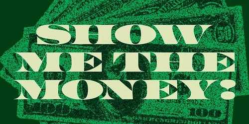
FONT INSPIRED BY U.S. CURRENCYA new typeface, Greed, has been created based on the font on U.S. currency. -Garrett Greed, the typeface, is good. Greed is pompous, ostentatious, and rude — a critical expression of our basest societal instincts. It is a bold, big-shouldered, unapologetic, and maximalist typeface, perfectly positioned for 2025, the year of more is more. Gordon Gekko would be proud. Greed's designer, Positype's Neil Summerour, began his research twelve years ago after a friend and fellow designer suggested that he create a series based on the seven deadly sins. Wood type influences anchored some of the series, but for Greed, he turned to the intricate lettering of US currency. (The deadly sins series never took shape as prompted, but the prompt more than served its purpose for the eventual development and release of Greed.) 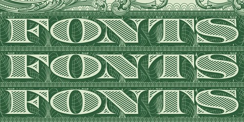
Honestly, I feel that so much of politics and society today is driven by Greed. Call it what it is.
Summerour's process is research-heavy, absorbing all he can about his chosen influences, including, he admits, 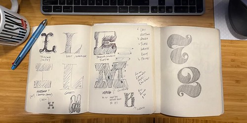
In typical Summerour fashion, there are a lot of quirky extras, glyphs, and features. Greed encompasses a complete Latin set, including Vietnamese. There is a full set of numerals (because, money!). Designers can play with stylistic alternatives, small numerals, super- and subscripts, Open-type-enabled fractions, cap height numerals, and a large selection of global currency symbols. Adding to Greed's flexibility, Summerour took care to finesse the gaps inherent in wide, large serif typefaces. If your Open Type Standard Ligatures feature is on, you'll find a set of alternate lowercase letter sets, such as ‘n-n,' to help you adjust your designs quickly and efficiently.
To read the complete article, see:
Wayne Homren, Editor The Numismatic Bibliomania Society is a non-profit organization promoting numismatic literature. See our web site at coinbooks.org. To submit items for publication in The E-Sylum, write to the Editor at this address: whomren@gmail.com To subscribe go to: Subscribe All Rights Reserved. NBS Home Page Contact the NBS webmaster 
|