PREV ARTICLE
NEXT ARTICLE
FULL ISSUE
PREV FULL ISSUE
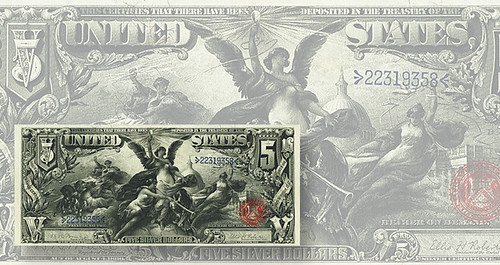
1896 EDUCATIONAL SERIES: A FLAWED EXPERIMENT
A Coin World article by William T. Gibbs published December 19, 2015 discusses the flawed execution of the magnificent 1896
Educational Series notes. Here's an excerpt; be sure to read the compete version online. -Editor

They were the most beautiful federal notes ever issued, vastly more artistic than anything in circulation in the United States today. And they were abject failures, replaced by new designs within two years in response to complaints from bank tellers and the public. They were the Series 1896 silver certificates — the Educational Series of $1, $2, and $5 notes. In a contest between artistry and practicality, art lost. What happened? Why were notes whose beauty is so prized today replaced so quickly? Blame the mural-style artwork, the “newness” factor, their susceptibility to counterfeiting, unhappy bank tellers, and saleswomen who objected to the “indelicate figures” on the notes. As the New York Times reported in 1897, they were “doomed.” The effort was noble. Treasury and Bureau of Engraving and Printing officials wanted to raise note design to new heights, much like officials sought to improve U.S. coinage design, starting a decade later. But a number of problems conspired to end the experiment sooner than expected. By 1893, Treasury Department and Bureau of Engraving and Printing officials had begun talking to artists about the next generation of silver certificate. Sometime before Nov. 1, 1893, researcher Gene Hessler writes, the Treasury Department had selected three muralists to create designs for the new notes. All three men — Will H. Low, E.H. Blashfield and Walter Shirlaw — were established artists, with Low and Blashfield being Paris-trained as painters and Shirlaw also being a bank note engraver. According to Hessler in his U.S. Essay, Proof and Specimen Notes, each was commissioned at $800 per design selected. The designs for the faces of the new notes would depart from the portrait style used on the existing silver certificates they were replacing. Officials gave the muralists a broad canvas with which to work, deciding, for the notes’ faces, to let each design encompass nearly the entire side of the note. A decision was also made to let the notes adhere as closely as possible to the designers’ original paintings. To do that, the BEP chose not to use lathework on the faces of the notes. According to Hessler, the 1896 silver certificates are the only federal notes issued since 1861 to lack this form of printing. That would become a problem. The notes debuted to mixed reviews. While an Aug. 15, 1897, New York Times article acknowledged that the artistry of the notes was well above previous issue, Hessler writes, the innovative approach at design was causing problems on multiple fronts. Heavy use of black ink on the faces made the notes overly dark and easily smudged. The smudging made them “suspicious with a little use” according to the article. Bank tellers had difficulty telling them apart, as “the number denominations [were] too indistinct for rapid use at the banks,” reported The Washington Times in a May 1, 1897, article. In a comment duplicated a century later after a massive redesign of Federal Reserve notes, the Aug. 15 article in the New York paper noted, “The first objection to them was that they were new.” Also, the notes were targets for counterfeiters, with the lack of complicated lathework on the faces making the job easier for forgers. Despite efforts to lighten the darkness of the faces and fix other problems, the criticisms of the three notes were so great that the government canceled work on the $10 and larger denominations and quickly began working on a replacement series. The Treasury secretary promised, “When the next change is made it will be to return to the old style notes — not necessarily to the old designs,” according to Hessler. The Treasury secretary added that “the designs will be so distinctive there will be no difficulty in confusing them.” The replacement Series 1899 notes, while attractive, are not in the same class as the 1896 notes, but they were successful, with the $1 and $5 notes not replaced until 1923. The grand experiment had ended in failure. To read the complete article, see:

Wayne Homren, Editor The Numismatic Bibliomania Society is a non-profit organization promoting numismatic literature. See our web site at coinbooks.org. To submit items for publication in The E-Sylum, write to the Editor at this address: whomren@gmail.com To subscribe go to: https://my.binhost.com/lists/listinfo/esylum All Rights Reserved. NBS Home Page Contact the NBS webmaster 
|